Show your stripes
Last week was #ShowYourStripes day, but what does this mean? In order to understand what’s going on, if you’re not aware of the #WarmingStripes, we have to go back and start by looking at the saying and the dictionary.
show (one's) (true) stripes
Is to reveal what one really believes, thinks or wants: to act in accordance with one's real personality, character or disposition.
It’s often in times of crisis that people will really show their stripes.
So #ShowingYourStripes is telling your truth, revealing who you really are. Interesting this expression is also closely aligned with a ‘time of crisis’, something that we will explore that a little more later.

#ShowYourStripes is about the Climate challenge
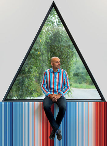
The Warming stripes were originally developed by Professor Ed Hawkins as a way to quickly, visually communicate the pattern of global temperature at various points around the world, country by country, using data from as far back as 1901.
Geeky bit
For most countries, the data comes from the Berkeley Earth temperature dataset to the end of 2022, this has recently been extended with ERA5-Land for 2023. For some countries (USA, UK, Switzerland, and Germany) the data comes from the relevant national meteorological agency.
For each country, the average temperature from 1961-2010 is set as the boundary between blue and red colours, and the colour scale varies from +/- 3.0 standard deviations of the annual average temperatures between 1901-2000. For the global average only, the UK Met Office HadCRUT5.0 dataset is used and the colour scale goes from -0.9°C to +0.9°C. The stripes are typically shown starting from around 1900 to 2023 but this can be longer or slightly shorter depending on the location and whether the historical data is available and considered robust.
What’s this got to do with DressCode?
Good question. Andy became involved in this project during the Covid lockdowns of 2020, he was contacted following a networking event from several months before, asked to develop a shirt that could bring the Climate Challenge to life in a new way.
This project involved us working with the British Antarctic Survey, preparing for a number of events where the BAS Innovation Team were looking for ways to expand the climate conversation, engage with people, ask for input, explore views and raise awareness about what they had learnt from the southern ocean and the glaciers in and around Antarctica.

This included events at Ice Worlds, Greenwich; Cambridge CleanTech Conference; The Sustainable Film awards at BAFTA; Bluedot and COP26 Glasgow. There were also numerous smaller activations supporting other climate charities and a programme of Climate Education for Business, run from the BAS headquarters in conjunction with CISL (Cambridge Institute of Sustainable Leadership).
Messaging
We worked with the team at BAS to explore what this message should look, and feel like. Having carried out in-depth research we felt that utilizing the Warming Stripes graphics were the best way forward. These stripes were gaining recognition within environment and climate interest groups. They were simple, fun and engaging, so…
Why reinvent the wheel
The more we looked at the data we were working with, the more and more I was convinced that whatever we did, however we expressed this visually, we needed to arrive at something simple and striking. As you’ll know, if you’re a regular reader, we are big fans of data art, check out our blog about it here, but this art is often intricate, requiring time to understand and process, time we wouldn’t have.
Collaboration
We shared our findings with the team at BAS. We all shared a love for the Warming Stripes and felt like this graphic had the potential to deliver what we were looking for – a simple, graphic communication of the challenge. During our meeting it became apparent that the BAS team knew Ed Hawkins and vice versa. We asked them to speak with him, explore his vision and whether he was comfortable with us working with them. To our great joy we got a really positive response and so began the design challenge – there’s another blog post about that here.

Adding balance
Everyone was very aware of the need to present a balanced story within the shirt. The Warming stripes are very powerful, what could we do to bring balance into the piece?
Like anything ‘balance’ can run both ways, we needed some geekery, afterall that’s what our brand is all about. So that balance came from the inner cuff and collar details which follow the DressCode mantra of GeekLux. As they are covered in graphs about CO2 and global temperature. This adds gravitas for those people who want to know and understand more, they bring the science to life.
The other balance is less geeky and more about adding an element of ‘feel good’. Enter another design detail, the black button. We deliberately wanted the bottom button of the front placket of the shirts to be different. Why? Well it’s the last button that you tie as you put a shirt on, making it different from the rest would catch the eye and get people thinking…”Why is this not the same?”
This was our opportunity to tell the other side of the story, to bring in some good vibes improving the balance. What I’m about to explain might not sound like it’s good vibes, but bare with me…the Ozone hole and the damage that mankind did to the upper atmosphere over time is well documented. Once we had realised the error of our ways, this ‘challenge’ then brought innovation and new solutions that are addressing the issue.
How long is this gonna take?
It's a fact that peoples attention spans are short, and getting ever shorter. Planets and environmental systems operate on a timeframe that is way longer, slower and more complicated than our humans lifespan.
The issue is, that we have a global ecosystem, moving incredibly slowly (until the damage is done, then it goes very fast) and an audience who really need to see something that stops the one-sided doom story – which we all know is a massive turn off.
The Ozone story, in terms of planetary timeframes is like yesterday. It’s also a great demonstration of the power we all have to influence and effect change. Our black button is all about the Ozone hole, a story that whilst it’s not finished yet, as in the hole isn’t fixed, though it has ‘healed’ a lot and is predicted to be rectified by the end of the century. This button demonstrates what we humans can a positive impact on our planet.
Packaging it all up
By this point we have the products, the shirts, they are designed and made. We have an interactive way to introduce them – the shirt freeze/melt from ice blocks, we can tell the story and engage people in a fun activities to guess the total melt time. But these are all individual bits that need something to hold them all together, to make them cohesive.

Enter #ShowYourStripes
Social research was telling us that there was no hashtag for all of this. Yes #WarmingStripes existed but it was a little cold (pun very much intended) and not very human devoid of emotion.
Andy felt that “Show Your Stripes” was the obvious solution, it felt right because it was exactly what we were doing. Plus it was an action that was achievable by everyone, at whatever level they wanted to be involved with #ShowYourStripes.
Andy felt that this expression was also strong enough - recognisable enough to be the positioning that would hold this entire project together – across everything!
The rest, as the saying goes, is history, we played our part, created the shirts and the events that happened around them. We have since passed the baton over to the audience and social media, where it has blossomed and expanded into a globally recognised day/event.
We are thrilled to have been involved in this, #ShowYourStripes is a powerful movement, delivering a lot of good things and helping people connect around the globe. Here’s just a few of our customers, and the things that they have attended, promoted and championed by showing their stripes.
 |
 |
 |
 |
 |
 |
 |
 |
 |